 +91-8121591617
Responsive Web Design (RWD)
Works even better on wide range of devices
The usage of smart phones and gadgets increased rapidly in the last decade. Now a day’s people started to access the sites from their smart phones and gadgets.
What is RWD ?
Works even better on wide range of devices The usage of smart phones and gadgets increased rapidly in the last decade. Now a day’s people started to access the sites from their smart phones and gadgets.
inWhat is RWD and why smart phones are connected to it?
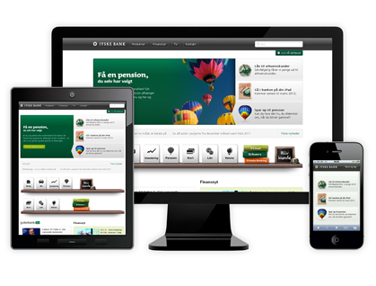
RWD is also called as responsive web designing. If a web designer creates a web page in Responsive design it “aligns itself” or “Resizes” depending on the type of device is viewed in. The device could be a desktop with different screen sizes, a tablet with 10inch screen or a smart phone with 5inch screen, the lay out with alter by itself according to the screen size. As a result one can avoid the visual damage of the site content.
In the past big companies used to maintain different versions of websites for desktop and mobile phones. But with RWD, you design only one website which will be functional in all gadgets.
There is a boom in the “mobile marketing” due to the usage of smart gadgets supported on 3G and 4G versions. So, the small and medium scale business should redesign their sites with Responsive themes to get an effective business from the mobile marketing.
Sreewebsoft is a creative expert in Responsive Web Designing. This is one stop site, where you can find templates for responsive themes or we can customize a theme according to your requirements.